New SimpleReport Template
This article is a bit dated. While the concepts are still valid, some of the details are slightly different for the v2 engine.
One of TuringTrader’s great strengths is the ability to create fully customizable reports. However, until now this meant a whole lot of work for developers, as the templates included with TuringTrader were rather basic. With the latest update, we have changed that: The new SimpleReport template offers beautiful aesthetics, new performance metrics, and Monte Carlo analysis.
Equity Curve and Drawdowns
After running a backtest, the first thing most developers are interested in is the equity curve. That’s why this is the first page we show, just like most other backtesting engines do. The chart provides a quick overview of the strategy’s performance and risk.
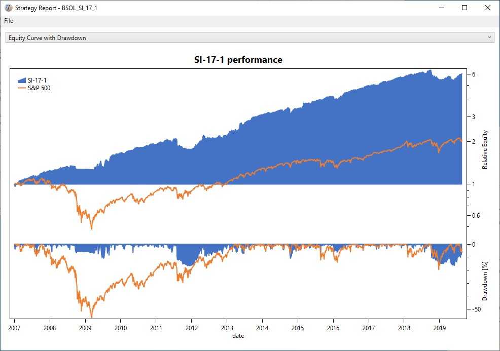
We firmly believe that performance should always be measured against a benchmark, which is why we include the strategy’s benchmark on the chart. To make it easier to spot irregularities in the strategy’s return, we show the equity on a logarithmic scale. Risk is the most critical aspect of any investment strategy, only surpassed by long-term performance. The template shows the risk as a drawdown or underwater chart right below the equity curve.
We’ve had this view for a while now, but the updated template has prettier colors and improved axes. Also, we added a feature to save charts as a PNG image, to make it easy to use TuringTrader’s charts in documents, presentations, blogs, or web pages.
Performance Metrics
After you’ve had your first visual impression of the strategy’s behavior, it is time for cold facts. The performance metrics page shows a selection of commonly used performance metrics:
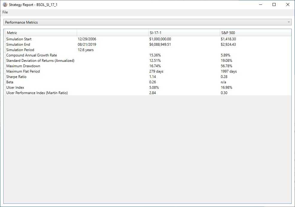
Again, you might feel you’ve seen this before, but there are some essential changes and improvements. The overall layout looks prettier and cleaner. Under the hood, we are calculating the Sharpe Ratio using the 3-Month Treasury Bill Rate as the risk-free return. We have added the Ulcer Index and the Ulcer Performance Index. And moving forward, we are likely going to add more metrics as we see fit. Also, we have added a feature to save the table as a CSV file.
Annual Performance Columns
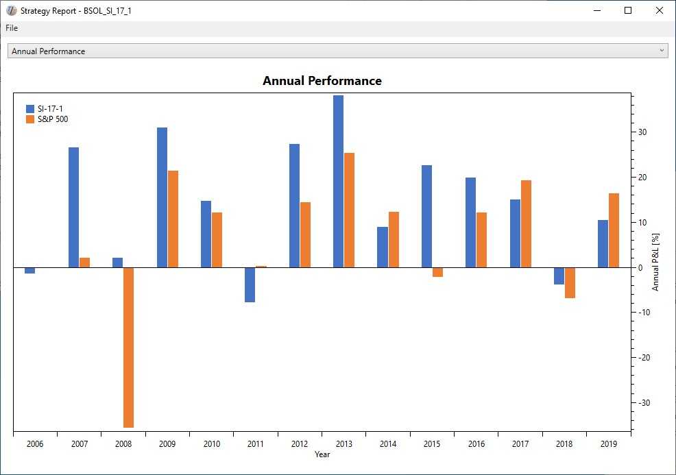
Now let’s get to the new views. First, we have added a page showing the yearly returns as columns, because that’s the way how many investors like to think about their assets. The chart speaks for itself:
Cumulative Distribution of Returns
The next view shows the cumulative distribution of returns. As with all of our views, we show the strategy alongside its benchmark:
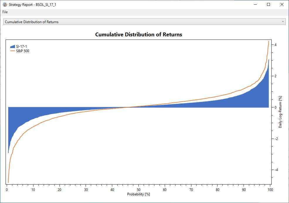
For those not familiar with Cumulative Distribution Functions, the chart shows the maximum daily return for a given probability. The chart above shows that 90% of the days our strategy has a return of about 1% or less.
What makes this chart especially useful is the comparison of a strategy to its benchmark. Here are some findings from the example above:
- Overall, our strategy above behaves similar to its benchmark but overall reduces daily volatility.
- The volatility reduction is stronger towards the downside than it is to the upside. Therefore, the strategy most likely generates a better risk-adjusted return than its benchmark.
Monte Carlo Analysis
Another brand new view we have added is the Monte Carlo Analysis. Monte Carlo Analysis takes a given distribution function, like the one from the previous page, reshuffles the returns in time, and creates a large number of “parallel universes” with their alternative realities. Then, it runs statistics on these alternative results:
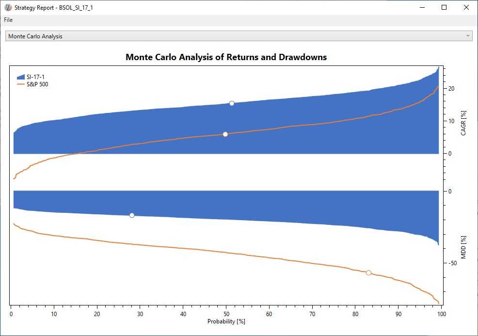
This method helps us develop a better idea of how representative a backtest result is, and what we should reasonably expect for out-of-sample performance. The view shows cumulative distribution functions for annual return and maximum drawdowns. The graphs include a marker, showing where the original backtest ranked.
Again, what makes this especially useful is the comparison to the benchmark. Here are some findings from the example chart:
- Overall, our strategy has higher returns and lower drawdowns than the benchmark for any given probability.
- Over the 12.6 years of the simulation, our strategy has positive returns in all parallel universes, while about 18% of universes show negative returns for our benchmark.
- About 83% of the parallel universes show lower maximum drawdowns for our benchmark while the remainder has even worse meltdowns than 2008.
- About 72% of the universes show higher drawdowns for our strategy, which tells us we might want to adjust our expectations accordingly: 90% of the tests have a maximum drawdown of 30% or less.
Monte Carlo analysis is an invaluable tool to have, as it helps to identify statistical flukes and develop more robust strategies.
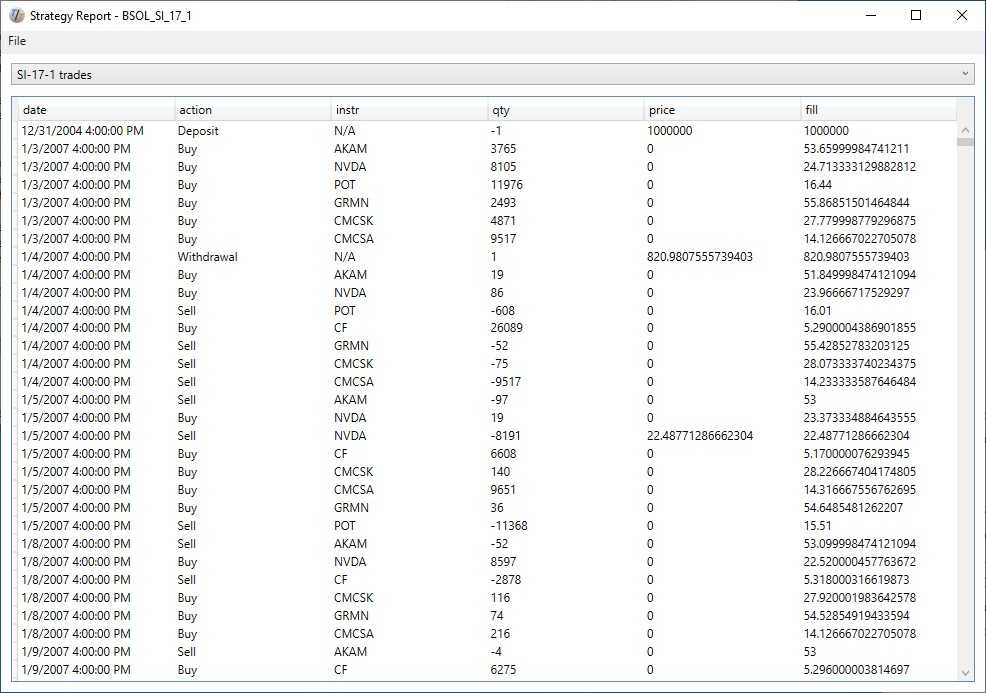
Custom Charts and Tables
While the default views are very useful, we are aware that developers of strategies will always want more. The SimpleReport template allows adding any number of strategy-specific charts or tables to address this need. As an example, we added a table with the list of trades taken by the strategy:
Using the Template
To create all of the default views shown above, we only need a few lines of code:
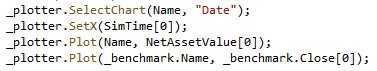
In a nutshell, a strategy needs to write its NetAssetValue along with the benchmark value to a plotter object. This is typically done on every bar, but other frequencies are also possible. Everything else is the same as outlined in our Demo 01.
We hope that this new template makes TuringTrader more approachable and more useful to you. Keep in mind that you can use the SimpleReport template as a basis for your customized templates. That way you can add any specific chart or metric you are missing right now. To do so, find the template’s code in our repository. The updated template will, of course, be included in the upcoming binary distribution, whenever we ready it. In the meantime, it is available for those following TuringTrader’s developer branch.
Happy coding!