SimpleReport Template
This post is a bit dated. We have since implemented native reports, which offer more features and far better styling.
TuringTrader’s reports are fully customizable, with just a little bit of programming in Excel VBA, R, or R-Markdown. However, until now TuringTrader only included some very basic templates. This has changed today: we have just released a gorgeous new template to visualize your strategies.
Charts
The new template is named ‘SimpleReport’ and currently only available for Excel. The main sheet looks like this:
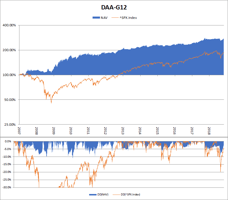
We see two panels here: The daily equity curve with a logarithmic scale on the top, and the daily drawdown with a linear scale on the bottom. Both charts show the strategy’s performance in blue, and the benchmark in orange.
Performance Metrics
In addition to the chart, the template also calculates some basic metrics. These are displayed to the right of the charts:
The following information is displayed:
- simulation range, with start date, end date, and range in fractional years
- absolute performance as start and end balance of the strategy, versus the chosen benchmark
- average annualized performance, or compound annual growth rate (CAGR)
- maximum drawdown (MDD)
- risk adjusted return as Sharpe Ratio
- beta as a measure of correlation between the strategy and the benchmark
This should be a good start.
Filtering
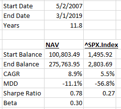
What’s making these reports especially useful, is how they work with Excel’s filtering. With just a few clicks, the date range can be filtered. Once you have done so, the chart as well as the metrics are re-calculated, now showing the filtered range.
Using this feature, you can drill down into the performance of your strategy, and understand how it was performing under various conditions, and in comparison to the benchmark.
Usage
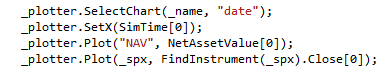
The template is very easy to use. We only need to plot 2 values along the simulation time: our strategy’s net asset value, and the benchmark. Here is a code snippet:
On the all following sheets, the template will plot one of the following:
- a simple chart, if all table cells are numeric. You can use this to create additional charts, e.g. plotting some relevant indicators.
- a simple table, if at least one table cell is non-numeric. This is great for printing your trade log.
We have adapted the strategies in the Books & Pubs section to use this new template.
Customization
While this is a powerful template, which is addressing many needs, we are sure that you have your own ideas. This is just the starting point. We invite you to customize the template to your liking. Change the colors. Add more key metrics. Make it your own. All it takes, is a little bit of VBA coding.
Happy coding!